Chapter 4: Temporal
What Is It?
Relational databases handle time series as regular rows – a price is just another record in a table, distinguished from other records by a date column. Neo4j handles time series as graph structure: each price is a node, connected to a stock node via a HAS_PRICE relationship. Temporal queries become traversal questions. Start at a stock node, follow its price nodes, filter by date, aggregate. The graph model makes the time dimension as queryable as any other structure in the graph.
Neo4j’s native date and datetime types are first-class values in Cypher. A date property on a node is not stored as a string – it has a structured representation that Cypher understands natively. You filter with WHERE p.date >= date($start), sort chronologically and compute durations with duration.between(). A range index on Price.date makes date-range queries fast regardless of how many price nodes are in the graph.
When Would You Reach for It?
Temporal queries in Neo4j earn their place when time is one dimension of a richer graph rather than the only dimension. Pure time series problems – high-frequency trading data, IoT sensor streams at millisecond resolution – belong in purpose-built time series databases. But when your time-varying data are connected to other entities that carry meaning, Neo4j handles the combination naturally.
Reach for Neo4j’s temporal capability when:
- Your time-varying data are connected to other nodes – issuers, counterparties, events
- You want to combine date-range queries with graph traversal in a single operation
- You need date arithmetic – durations, period comparisons – as part of a graph query
- You’re already using Neo4j and don’t want to add a separate time series store
Financial data are a natural fit: prices are time series, but stocks are connected to each other through shared market behavior and the relationship between two stocks’ price histories is itself a meaningful query.
The Use Case
For this chapter we’ll build a stock price analysis tool for a curated subset of S&P 500 companies. Users can view the full price history for any symbol, display it as a candlestick chart with configurable bucket sizes, overlay 20-day and 50-day moving averages, compare the performance of all symbols across the full five-year period and explore the price correlation between any two symbols.
The Data
We use the S&P 500 historical price dataset from Kaggle, published under CC0 license. The full dataset covers 505 symbols from February 2013 to February 2018. We load a curated subset of 150 symbols across major sectors – Technology, Financials, Healthcare, Consumer and others – which keeps the total node count comfortably within Aura’s free-tier limit of 200,000 nodes.
The graph model is:
(:Stock {symbol})-[:HAS_PRICE]->(:Price {date, open, high, low, close, volume})
Stock nodes carry only the symbol property. Price nodes carry the full OHLCV data for one trading day. At 150 symbols over roughly 1,260 trading days each, the graph contains around 189,000 Price nodes.
Building the Application
Prerequisites
You’ll need a Neo4j Aura free-tier instance with the connection details stored as environment variables.
Loading the Graph
We create a uniqueness constraint on Stock.symbol and a range index on Price.date, then load in two passes:
session.run("""
    CREATE CONSTRAINT stock_symbol IF NOT EXISTS
    FOR (s:Stock) REQUIRE s.symbol IS UNIQUE
""")

session.run("""
    CREATE INDEX price_date IF NOT EXISTS
    FOR (p:Price) ON (p.date)
""")

# One Stock node per symbol
session.run("""
    UNWIND $symbols AS sym
    MERGE (:Stock {symbol: sym})
""", symbols=symbols)
Price nodes are loaded in batches of 1,000 rows using UNWIND to keep transaction size manageable:
for chunk in tqdm(chunks(records, CHUNK_SIZE)):
    session.run("""
        UNWIND $rows AS row
        MATCH (s:Stock {symbol: row.symbol})
        CREATE (p:Price {
            date:   date(row.date),
            open:   row.open,
            high:   row.high,
            low:    row.low,
            close:  row.close,
            volume: row.volume
        })
        CREATE (s)-[:HAS_PRICE]->(p)
    """, rows=chunk)
We use CREATE rather than MERGE for price nodes – each date is unique per stock and we’re loading clean data, so MERGE would add overhead without benefit.
Query 1: Price History
The price history query filters by date using Neo4j’s native date() function:
result = session.run("""
    MATCH (s:Stock {symbol: $symbol})-[:HAS_PRICE]->(p:Price)
    WHERE p.date >= date($start) AND p.date <= date($end)
    RETURN p.date  AS date,
           p.open  AS open,
           p.high  AS high,
           p.low   AS low,
           p.close AS close
    ORDER BY p.date
""", symbol=SYMBOL, start=START_DATE, end=END_DATE)
Neo4j returns date values as native Python datetime.date objects. To use them as a pandas datetime index for resampling, convert with pd.to_datetime(df["date"].astype(str)).
Query 2: Candlestick Chart
The daily OHLC data comes back from Neo4j as individual rows. We bucket it into N-day windows in pandas using resample() and agg():
BUCKET_DAYS = 5

ohlc_df = (
    price_df
    .set_index("date")
    .resample(f"{BUCKET_DAYS}D")
    .agg(
        open=("open",  "first"),
        high=("high",  "max"),
        low=("low",   "min"),
        close=("close","last")
    )
    .dropna()
    .reset_index()
)
Each bucket takes the opening price of the first day, the closing price of the last day and the high and low across the entire window. The .dropna() step removes any empty buckets caused by weekends or holidays at period boundaries.
Plotting with Plotly’s go.Candlestick requires one formatting choice: set type="category" on the x-axis. Without it, Plotly treats the date axis as continuous and renders gaps for weekends and holidays as empty space, which makes the chart look sparse. With type="category", each bucket is an equal-width column regardless of the calendar gap:
fig.update_xaxes(
    type="category",
    tickangle=-45,
    tickvals=ohlc_df["date"][::max(1, len(ohlc_df)//12)].astype(str).tolist()
)
Figure 4-1 shows an example using the AAPL symbol.
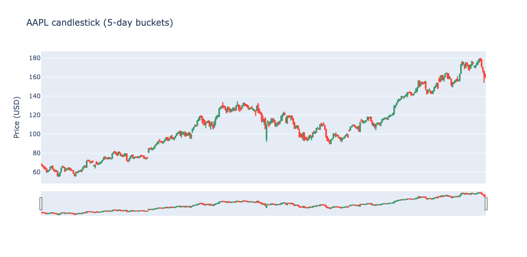
Figure 4-1. AAPL Candlestick.
Query 3: Moving Averages
Moving averages are computed in pandas after retrieving the price series from Neo4j. Cypher has no built-in rolling window function and pandas.Series.rolling() is both cleaner and faster for this purpose:
price_df["ma_20"] = price_df["close"].rolling(window=20).mean()
price_df["ma_50"] = price_df["close"].rolling(window=50).mean()
The 20-day MA captures short-to-medium term trend; the 50-day MA shows the longer-term direction. We overlay both on the closing price as a three-line chart in Plotly.
Figure 4-2 shows an example using the AAPL symbol.
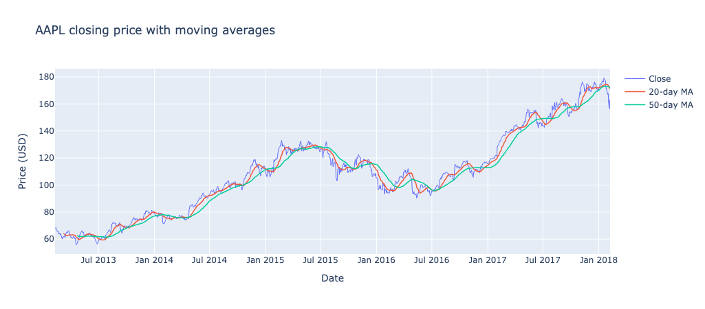
Figure 4-2. AAPL Moving Averages.
Query 4: Best and Worst Performers
The performance query runs entirely in Cypher, using min() and max() on the date to anchor the first and last price nodes:
result = session.run("""
    MATCH (s:Stock)-[:HAS_PRICE]->(p:Price)
    WITH s.symbol AS symbol,
         min(p.date) AS first_date,
         max(p.date) AS last_date
    MATCH (s:Stock {symbol: symbol})-[:HAS_PRICE]->(first:Price {date: first_date})
    MATCH (s)-[:HAS_PRICE]->(last:Price  {date: last_date})
    WITH symbol,
         first.close AS first_price,
         last.close  AS last_price,
         round((last.close - first.close) / first.close * 100, 2) AS pct_change
    RETURN symbol, first_price, last_price, pct_change
    ORDER BY pct_change DESC
""")
The query anchors on min(p.date) and max(p.date) rather than literal start and end dates because different symbols may have different first and last trading days in the dataset – this approach correctly handles any gaps in coverage. The results are displayed as a bar chart of the top 10 and bottom 10 performers, colored green for positive and red for negative returns.
Query 5: Price Correlation
Do two stocks move together? We fetch the closing prices for both symbols on matching dates in a single Cypher query and compute the Pearson correlation in pandas:
result = session.run("""
    MATCH (a:Stock {symbol: $sym_a})-[:HAS_PRICE]->(pa:Price)
    MATCH (b:Stock {symbol: $sym_b})-[:HAS_PRICE]->(pb:Price)
    WHERE pa.date = pb.date
    RETURN pa.date  AS date,
           pa.close AS price_a,
           pb.close AS price_b
    ORDER BY pa.date
""", sym_a=SYMBOL_A, sym_b=SYMBOL_B)

correlation = corr_df["price_a"].corr(corr_df["price_b"])
The WHERE pa.date = pb.date join happens in the graph query itself – Neo4j matches price nodes from both stocks on the same date. We visualize the result as a dual-axis line chart, with each stock on its own y-axis so their price scales don’t interfere.
The Streamlit App
The application has three tabs. The Candlestick tab lets users pick a symbol from a dropdown, a date range, and a bucket size from a sidebar slider. It displays a summary of trading day count, first close and last close, then the candlestick chart. The Moving Average tab shows the same price series with 20-day and 50-day moving averages overlaid. The Performance tab shows the top 10 and bottom 10 performers across the full five-year period as a bar chart, with data tables for each group below.
The sidebar controls – symbol, date range, bucket size – apply to the Candlestick and Moving Average tabs. The Performance tab runs a separate cached query over all symbols and ignores the date range selection.
What You’d Hit in Production
Node count. Aura’s free tier caps at 200,000 nodes. 150 symbols at ~1,260 trading days each produces around 189,000 price nodes, which fits. The full 505-symbol dataset would produce around 636,000 price nodes and requires a paid tier. If you need more symbols, consider whether you need all five years of data or could work with a shorter window.
Candlestick x-axis. The type="category" setting on the x-axis is essential for candlestick charts with date gaps. Without it, Plotly renders weekends and holidays as empty columns, making the chart hard to read. This applies to any OHLC chart with non-continuous dates.
Date conversion. Neo4j returns date values as Python datetime.date objects. Pandas needs them as datetime64 for resample() to work. The conversion pd.to_datetime(df["date"].astype(str)) is reliable and handles any edge cases in the date representation.
Intra-day data. The one-price-per-trading-day model doesn’t extend to intra-day or tick data. Minute-level data for 150 stocks over five years would be around 115 million price nodes – well beyond what Neo4j Aura’s free tier can hold.
Moving averages in Cypher. Computing a rolling mean in pure Cypher is possible but verbose and slow compared to pandas. The division of labor in this chapter – Neo4j for retrieval and filtering, pandas for numerical computation – is the right default for this kind of analytical workload.
Going Further
Prices and dates are structured, numeric data. Every property in chapters 1 through 4 has been a scalar: a name, a coordinate, a date, a number. Chapter 5 explores what happens when nodes need to carry richer, more complex payloads – variable-structure metadata that differs across instances of the same node type. That requires a different approach to property storage and it’s where we go next.